

Colours, like features, follow the changes of the emotions
- Pablo Picasso
As Winter marches on, with its dark mornings, bitter evenings and early sunsets, many of us are looking forward to brighter days. The muted colours add a grey filter to daily life, but that doesn't mean we have to settle for monochrome homes.
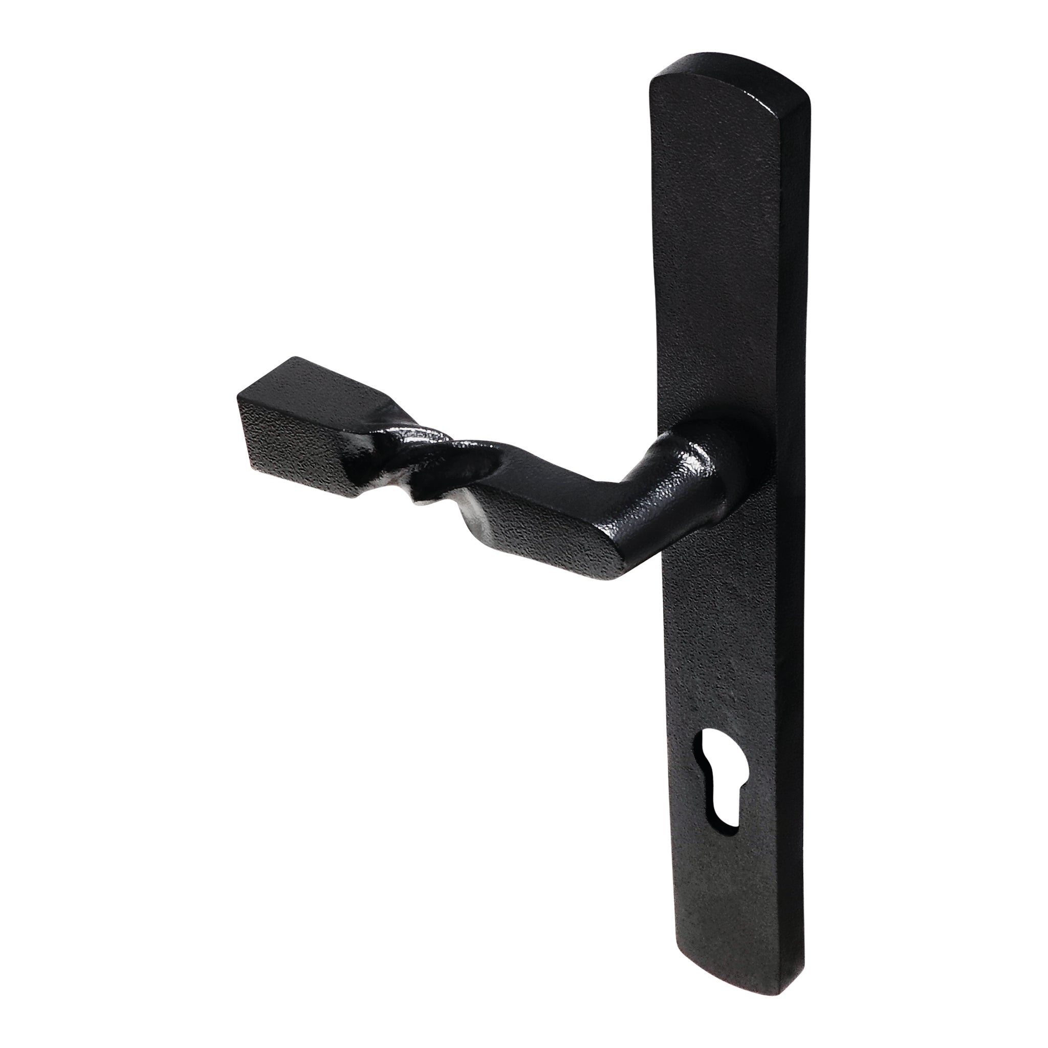
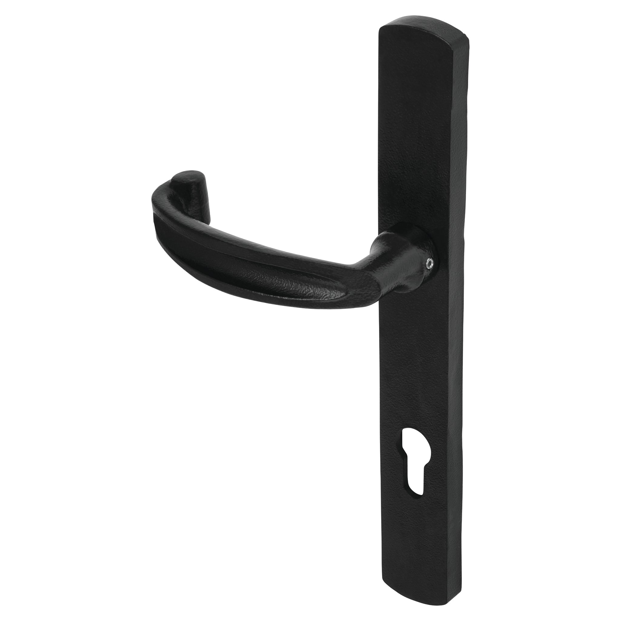
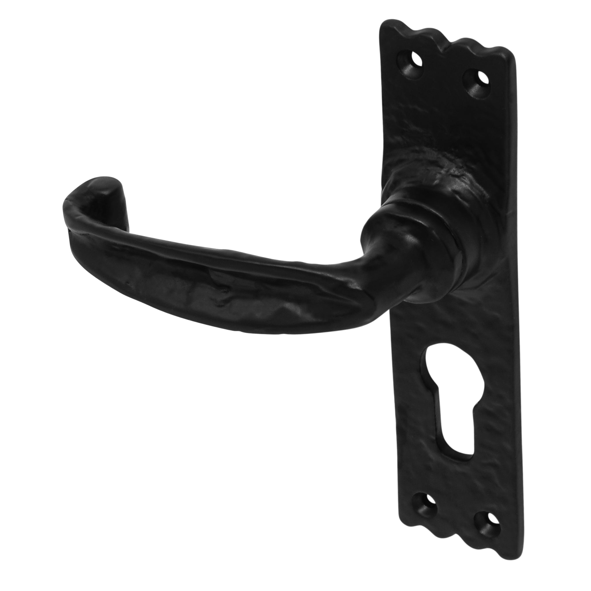
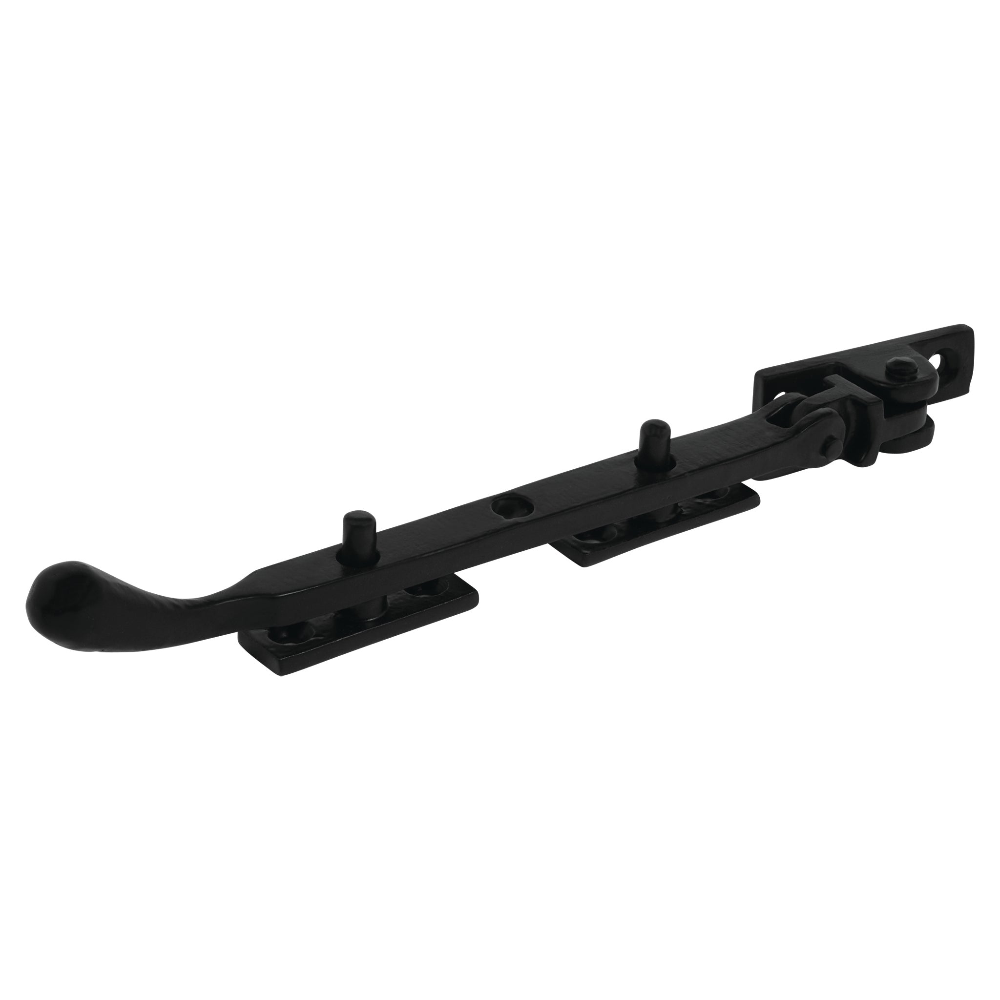
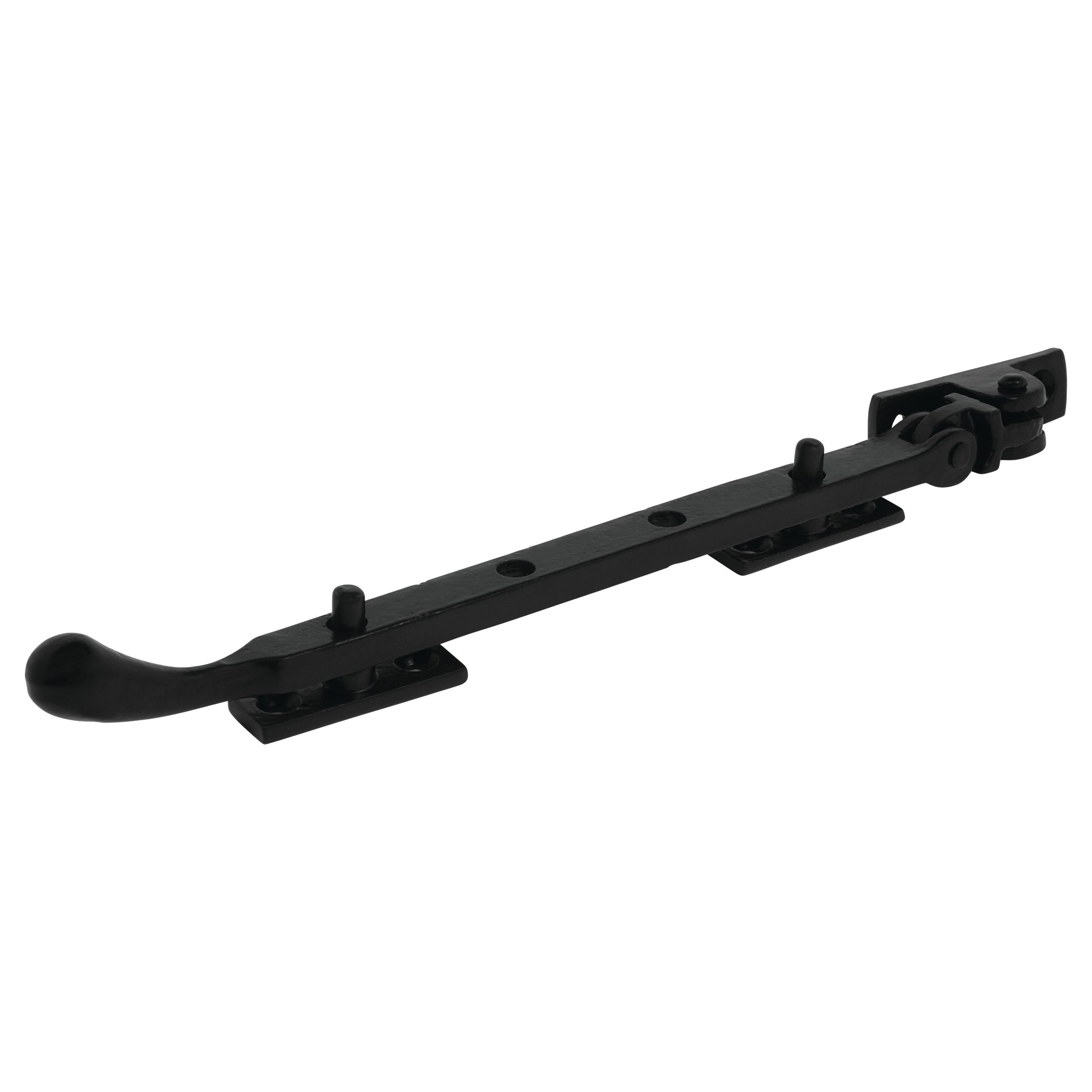
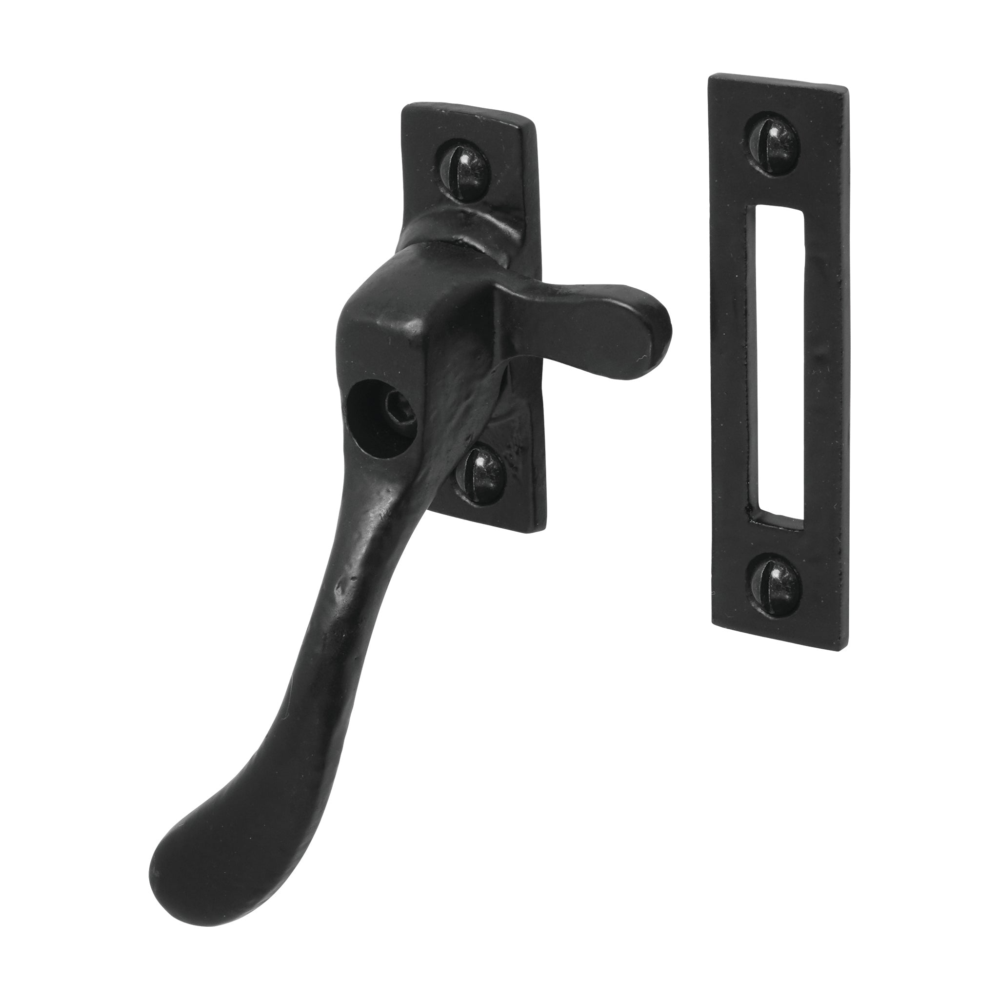
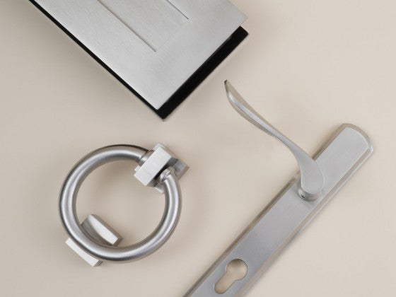
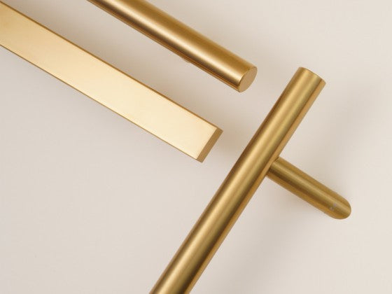
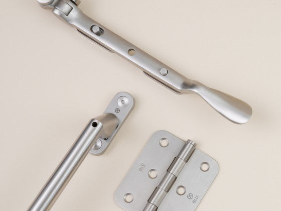
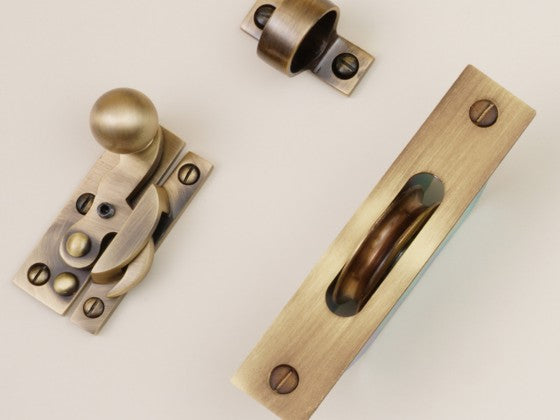
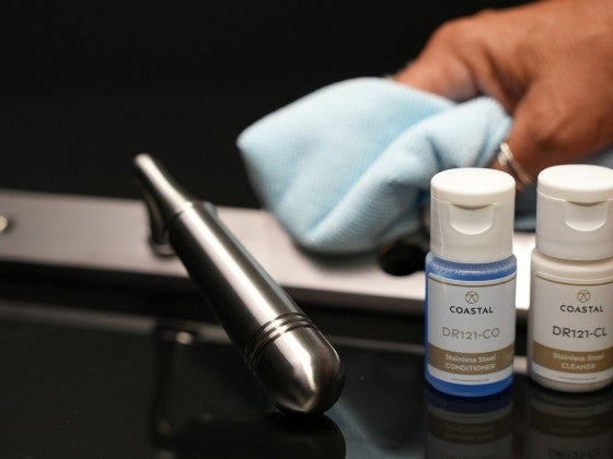
We've taken a cold hard look at the dark months of Winter and added a splash of inspiration with a collection of mood boards. Featuring the stark, simple shades and textures of antique stainless steel Duratique hardware, we present four very different looks for doors and windows.

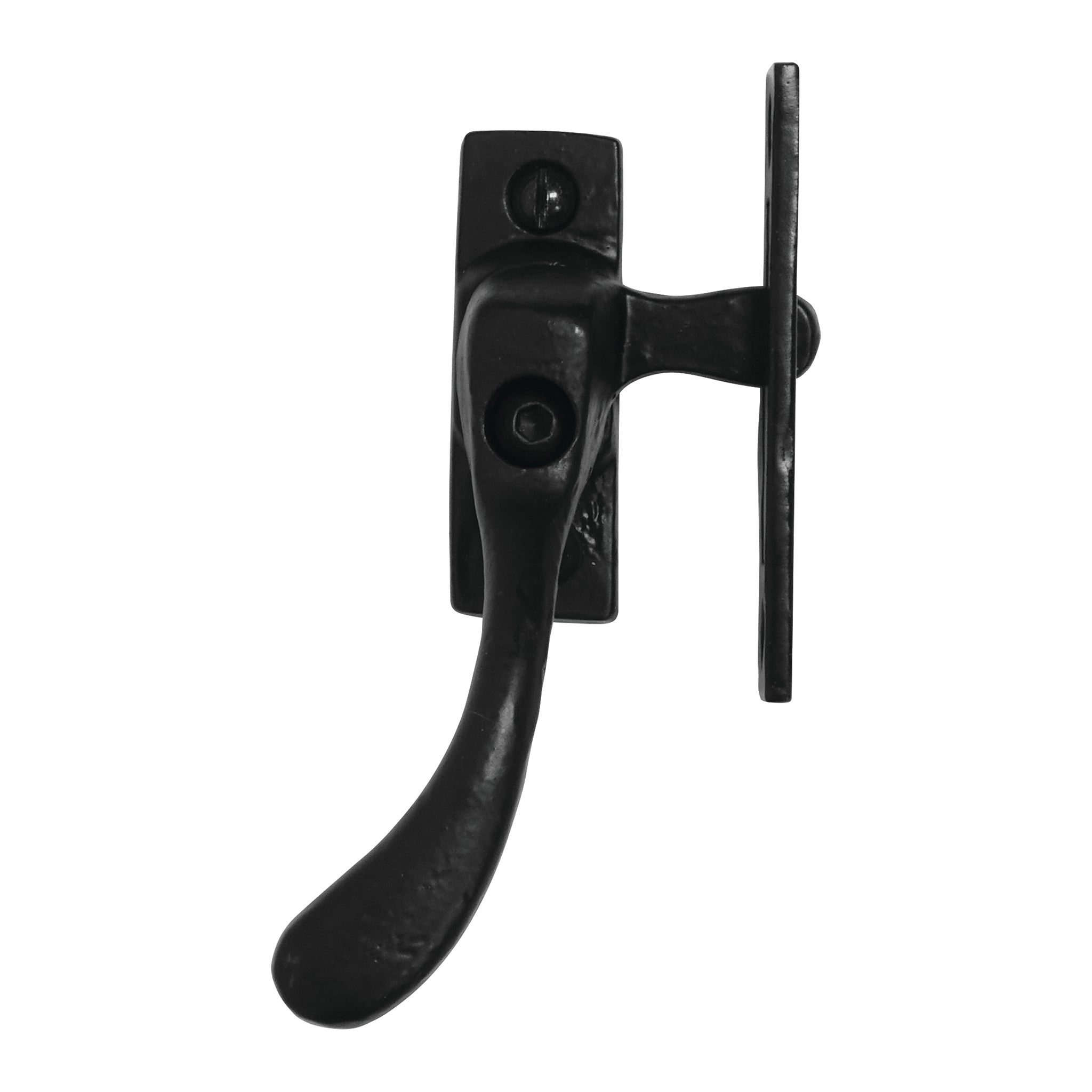
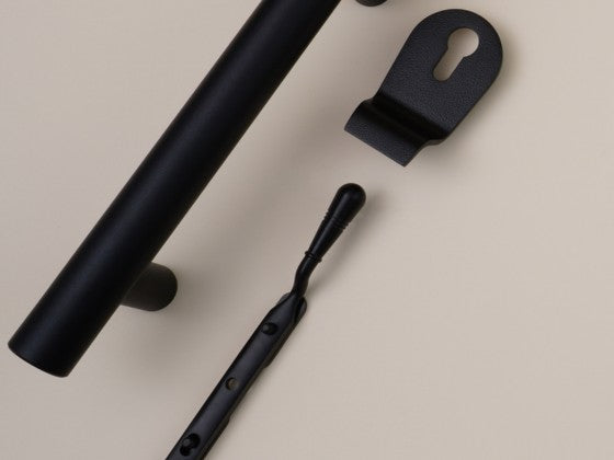
Pastel, bold, neutral or natural, black duratique hardware looks great
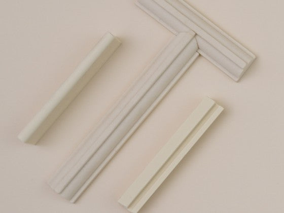
Pastel Shades
Pastel colours such as lemon, mint and lavender are enjoying a resurgence in popularity as designers, marketers and architects fall in love with their energetic qualities. They and have been shown to make us feel brighter and more optimistic, while also calming and soothing.

Pastel colours provide a high impact backdrop for the hardware
Breezy and bright, the subtle but powerful pastel shades evoke feelings of spring time, new beginnings and joy. They are also associated with holidays, beach huts, candy floss and ice-cream, communicating escapism and glamour. Who wouldn't want a front door that adds a spring to their step?
Bold Splashes
In sharp contrast to subtle pastels are the bright and bold colours, comprising primary and secondary shades of red, blue, yellow, green, purple and orange.

Bold colours make the black antique hardware pop
Bright colours were rarely seen in clothing or design prior to the 18th Century, until the widepsread use of bold pigments and dyes brought colour to the masses. Today, the primary colours are used effectively by brands all over the world. Imagine McDonald's without its iconic yellow, Cadbury without its purple or Coca Cola without its red; unthinkable.
The strong high impact blacks of Duratique look great against contrasting vibrant colours. While the rest of your home may be neutral in greys and whites, a pop of colour from a front door provides a balanced canvas that packs a punch.
Neutral Hues
While colour trends come and go, neutral shades provide an elegant palette that is both sophisticated and calming.

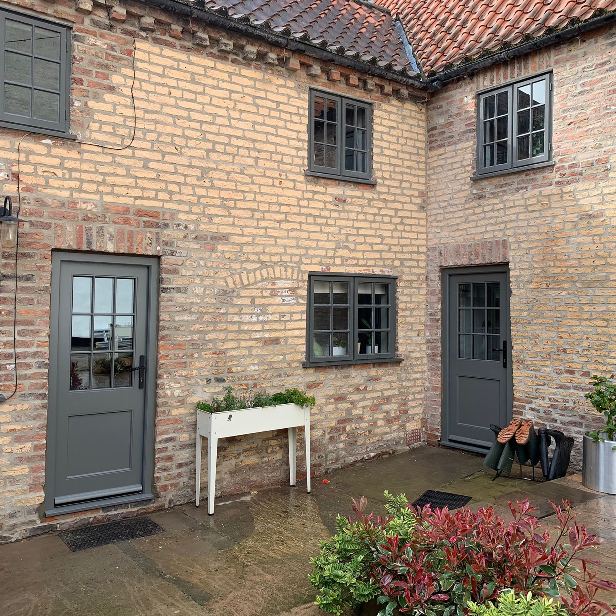
A neutral colour scheme is versatile and calming
Neutral shades, such as beige, grey, taupe, cream, black and white, are used to provide balance to a design, giving you the freedom to experiment with accent colours and design elements elsewhere.
Natural Tones
Natural materials like wood, stone and plants add texture and warmth to a home, inside and out.

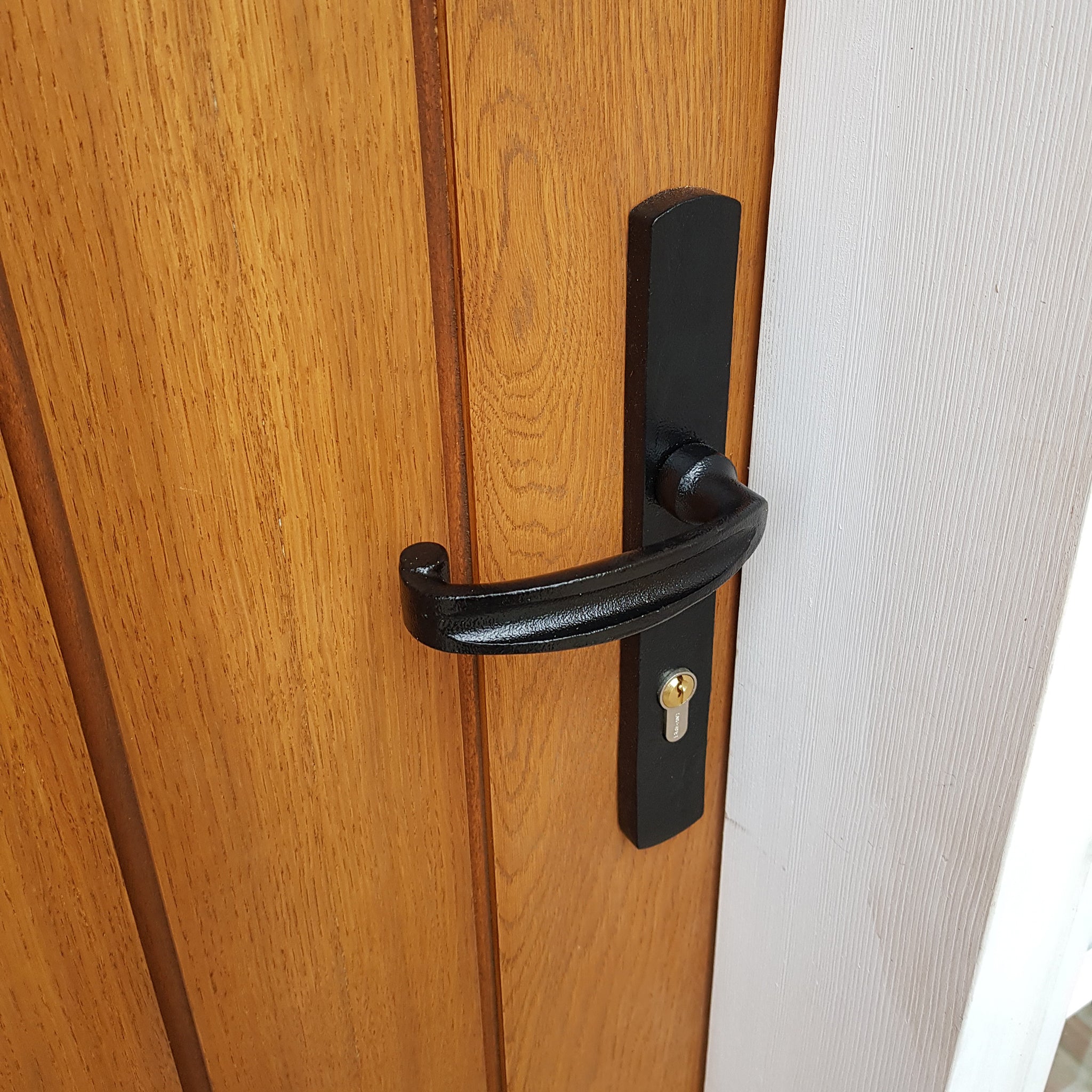
Natural tones
Incorporating these natural elements promotes wellbeing and productivity, fostering a positive environment and boosting mood. Wood is a fantastic pairing for the black antique door hardware, providing a rustic textured backdrop to the strong clean lines of Duratique.
The tactile nature of the Duratique range pairs well with pastels, bold colours, neutrals and natural materials. Whatever style you choose, we'd love to see the results - share online and tag us to be in with a chance of being featured as our project of the month.